Klimt Colour Palettes
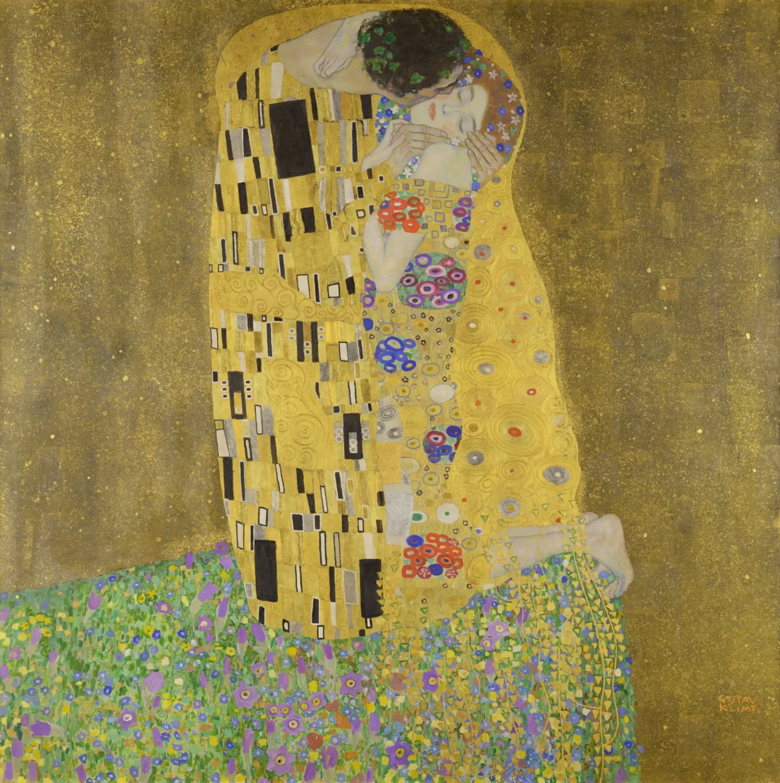
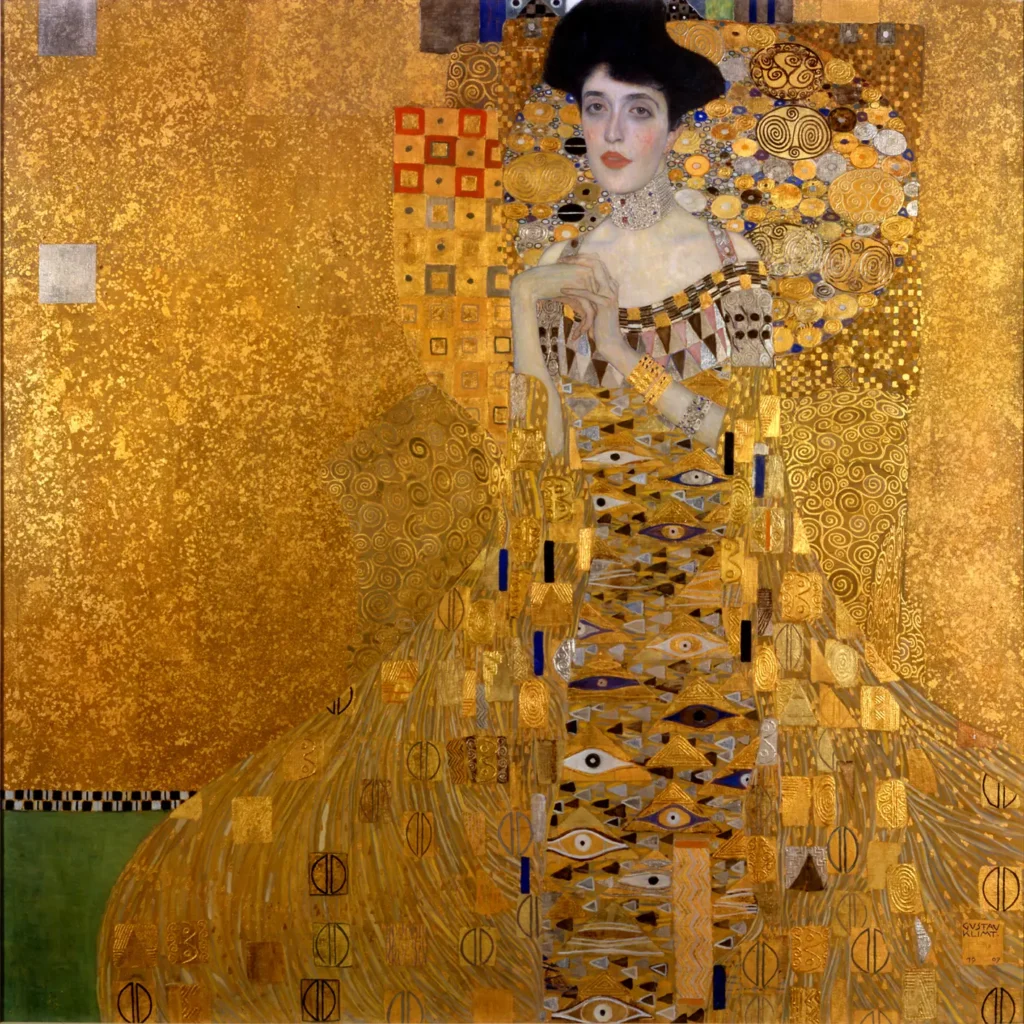
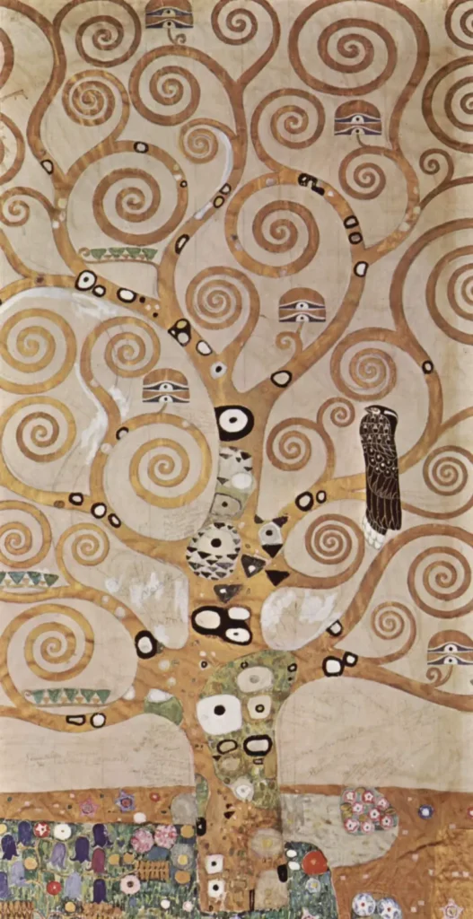
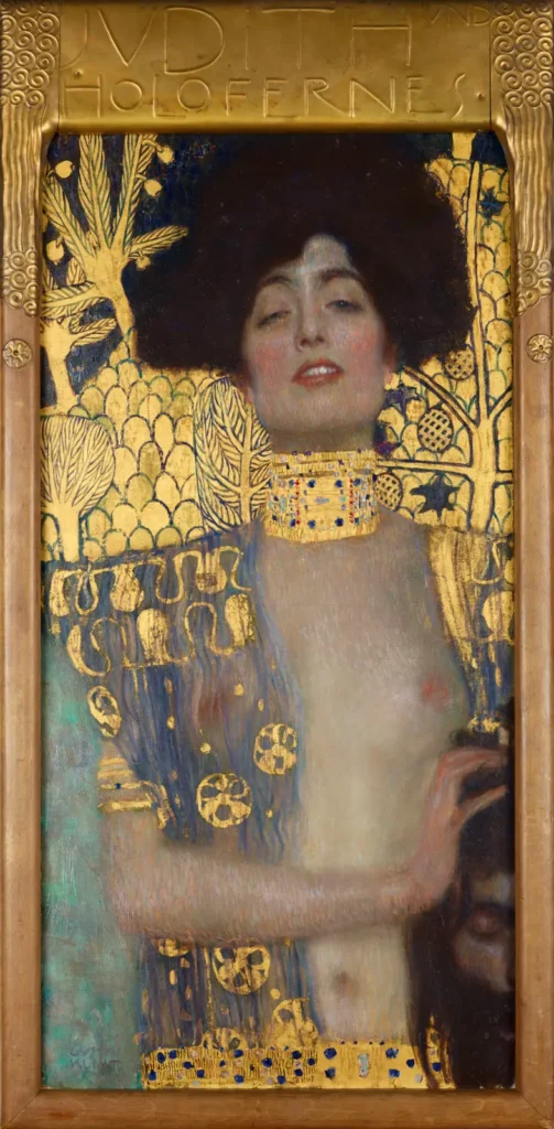
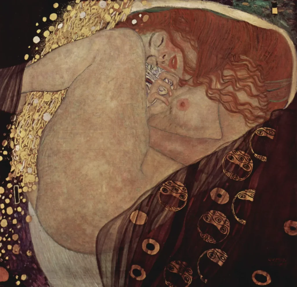
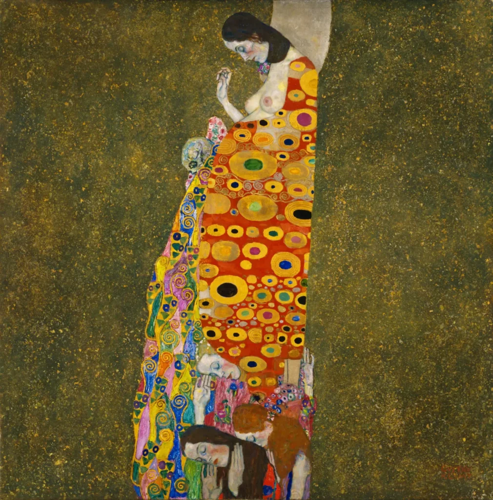
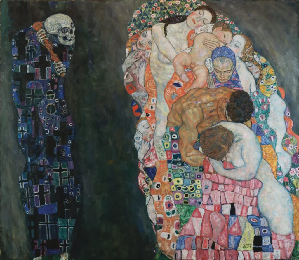
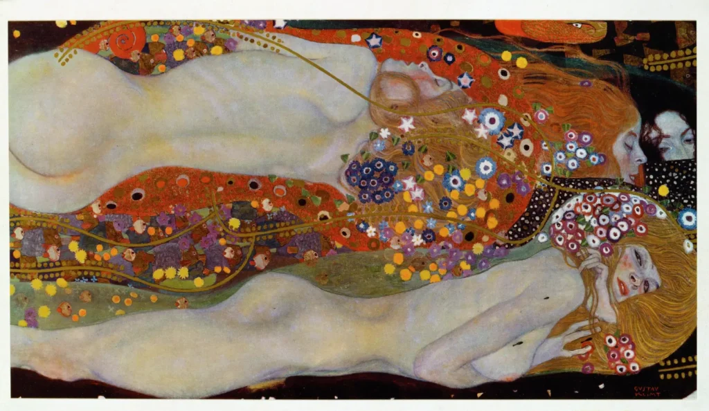
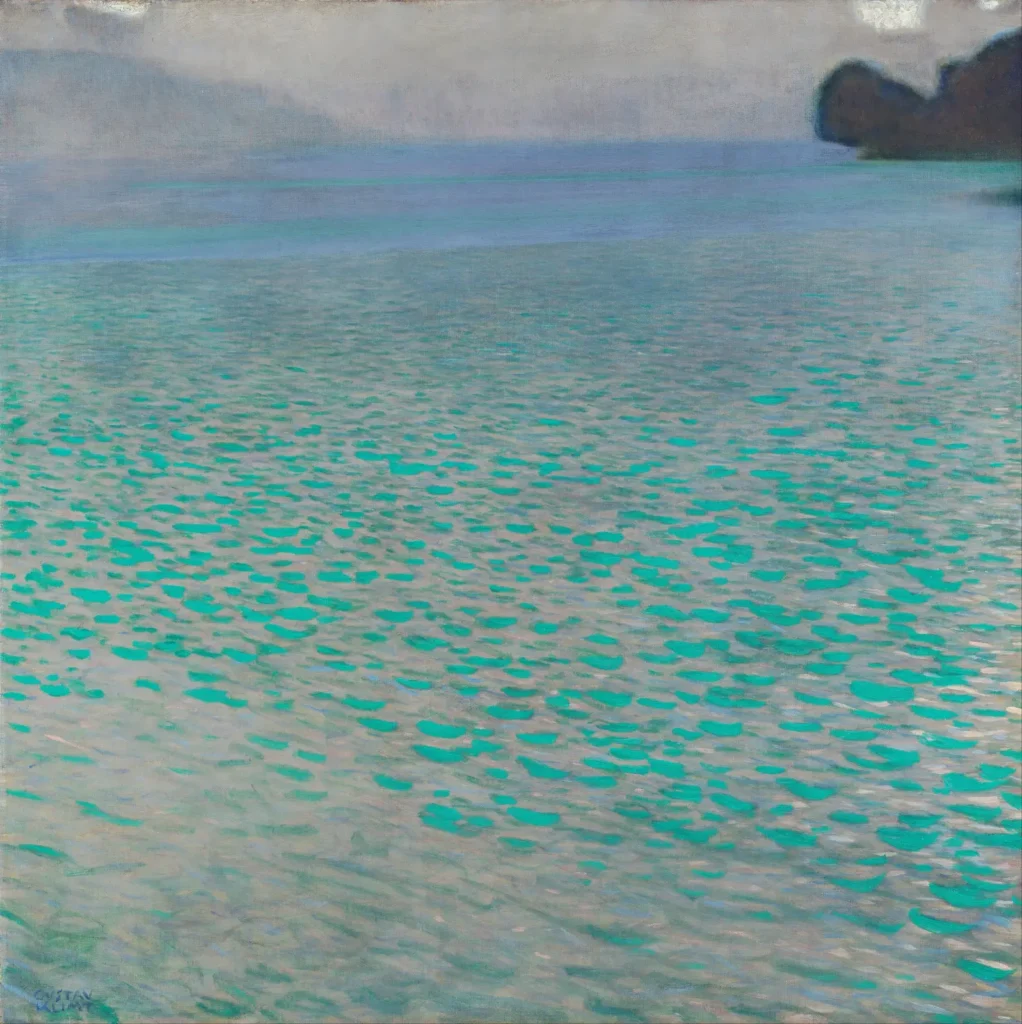
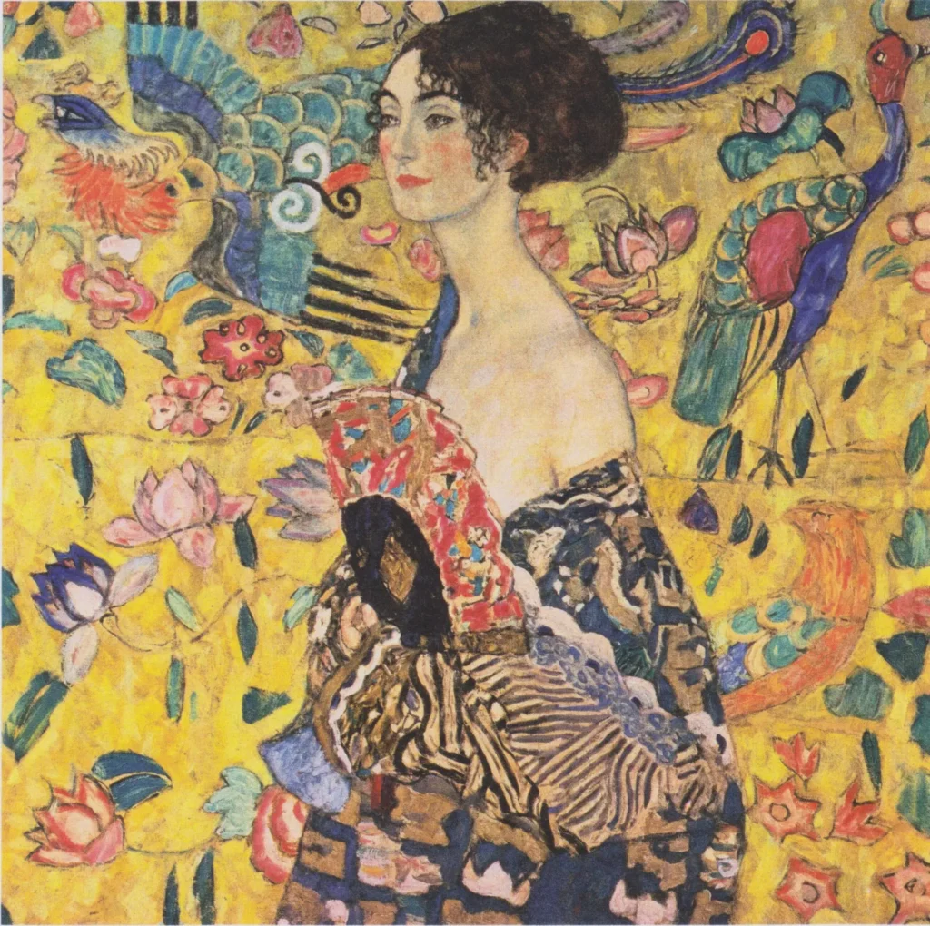
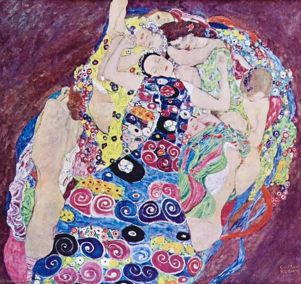
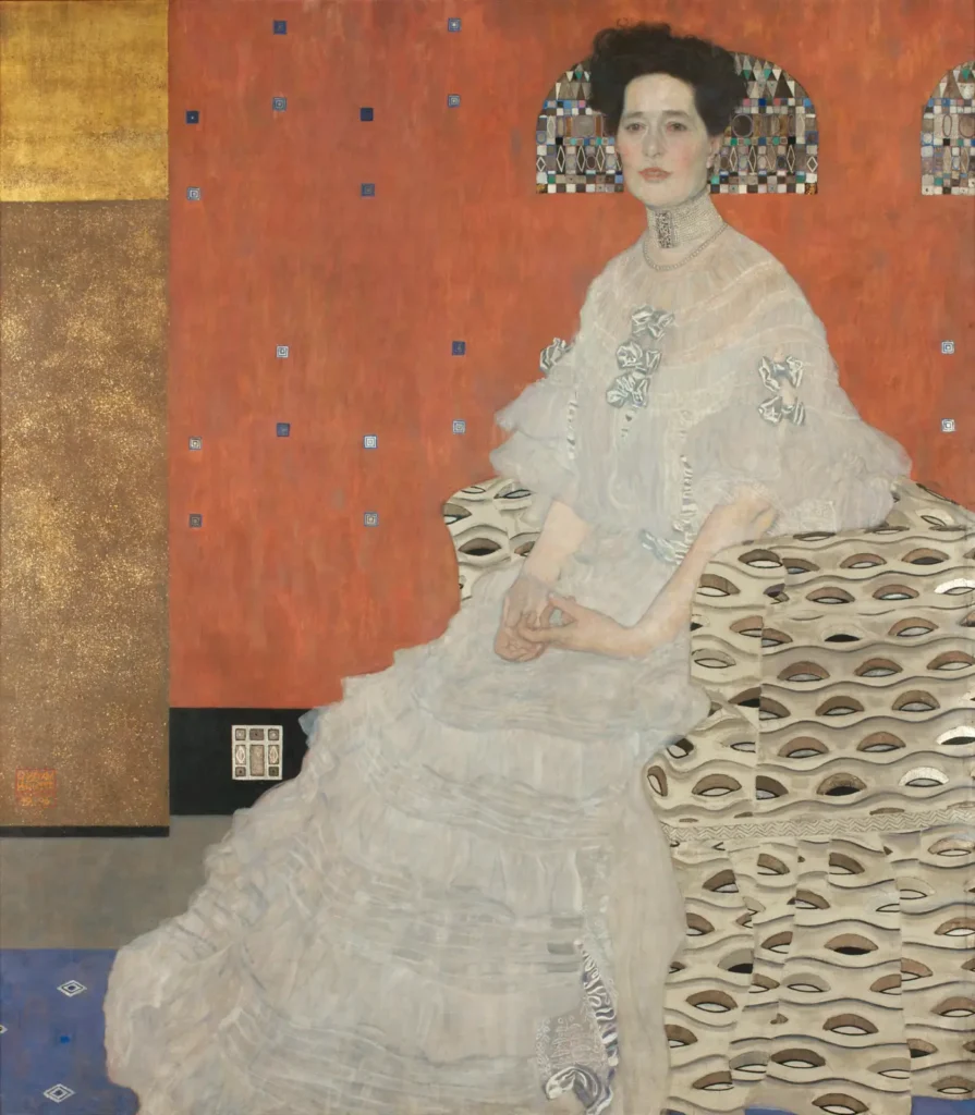
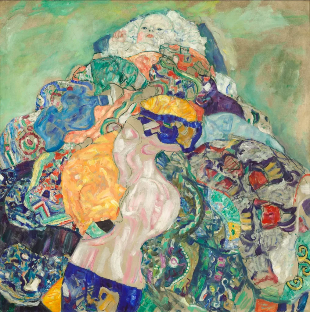
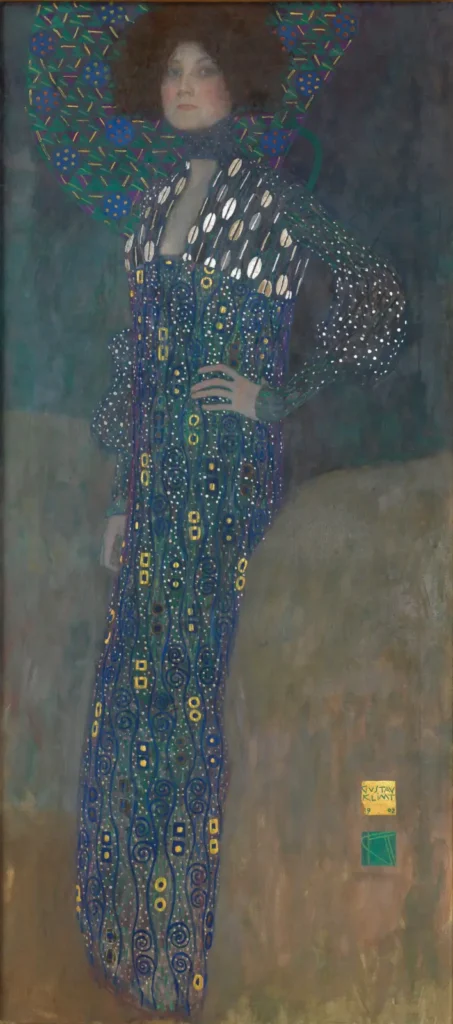
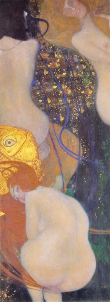
Six-colour palettes drawn from 18 of Gustav Klimt’s paintings, from the burnished golds of The Kiss to the lake blues of the Attersee. Click any swatch to copy its hex code, or copy a whole palette as CSS variables for your next design.
How these palettes were made
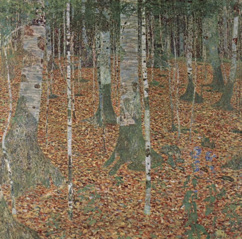
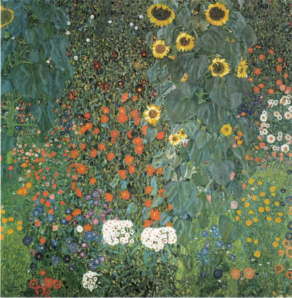
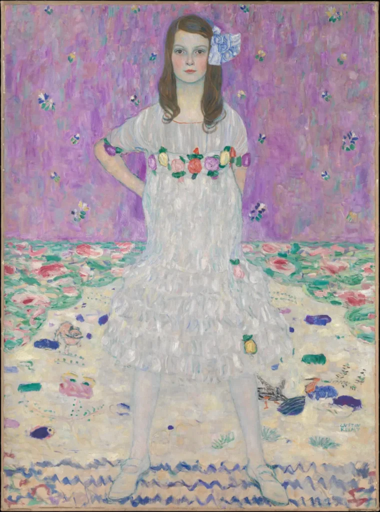
Each palette was extracted from a high-resolution, public-domain reproduction of the painting by grouping its pixels into the six most representative colours, ordered from most to least dominant. Reproductions vary, and real gold leaf changes with the light in a way no screen can show, so treat these as a starting point rather than an exact match to the canvas.
Klimt’s colours
During the Golden Phase Klimt built his paintings around real gold and silver leaf, set against deep ochres, browns and blacks, with small bursts of red, blue and green in the ornament. His landscapes are dominated by greens and blue-greens, and after 1910 his palette brightened dramatically, with the pinks, violets and turquoises of portraits such as Mäda Primavesi. Free to use for any project; a link back to iKlimt is appreciated.